Monday, May 27, 2013

Zen Brush App Review for the iPhone and iPad

Zen Brush sketch on old paper.
Recently I received PenGo's BrushPen and I was very excited about using it with Zen Brush based on the images that I found in iTunes, but was disappointed in the apps' capabilities. Zen Brush is a monochromatic painting app that helps recreate the look of Chinese and Japanese silkscreen painting. While looking for a good painting program I read some side reviews about the program saying it was one of the best painting programs around.

Zen Brush does create marks that look a lot like silkscreen painting and as a water-colorist I love the look of the marks on the app, but the lack of brushes is disappointing to say the least. Zen Brush allows you to adjust the color of the app between gray and black or light brown and dark brown depending on the paper you have selected for your background. The look of the brush strokes reminding me a lot of ink brush sketching for my beginning drawing classes in college.

I love the look and the feel of the app as well as the effects some of the different papers bring to the table, but the lack of brushes keeps me from being able to recommend this app to artists that enjoy ink wash or watercolor. If they could just give the user a few more options in brushes, being able to adjust the opacity and make a few changes this app would be right up there with some of the best.


Zen Brush has lots of backgrounds to choose from.
Pros and Cons for Zen Brush for the iPad...

Pros

  • Makes amazing ink washes with a very wide (and I mean wide) range of papers ranging from old Japanese papers, colored papers, metallic papers, framed works and of course some that are kind of far out there like seasonal papers for different times of the year.
Cons
  • Color limitations to monochromatic only which is okay if you go in realizing that the app is based on silk-screen painting from the orient.
  • The lack of brush options. If this is fixed I would give it as many stars as possible.
I am hesitant to recommend this app because if you are like me and you love ink wash or watercolor you will be so excited about what this app can do and equally disappointed in what it can't.

I give Zen Brush...
1 out of 5 stars


PenGo Paint App Review for the iPad

Recently I received a stylus from PenGo Creative, BrushPen Creative Tool System, which included a QR code and information for their creative app called PenGo Paint for the iPad. I reviewed the BrushPen Creative Tool System and decided to give PenGo Paint a whirl.

PenGo's Paint  is limiting when it comes to marks.
Like most creative apps PenGo Paint has several brushes for you access, layers, a color editing tool, etc, but that app itself does little to sets it apart from the competition. The app comes with five different brushes with different marks under each brush, but most of the marks are grainy or come out looking like rough 8-bit NES graphics. The line quality is pretty much the same from brush to brush so regardless if you are using the pen tool or the brush tool you will not be able to tell much difference.

PenGo Paint has layers, a basic color selector tool that comes standard with most sketching or digital painting apps and

Now to be fair it is a free program geared at promoting its' stylus rather than a cutting edge sketching app so you get what you pay for. It doesn't stack up with apps like ProCreate or Sketchbook Pro, but as far as free apps go it is not bad.

Pros and Cons for PenGo Paint...

Pros
PenGo Paint does let you export as a PSD file.
  • Yep, you guessed it. It is free!
  • When I went into the save option PenGo Paint does allow you to export your images as a PNG or a PSD file which is more then apps like Sketchbook Pro does and that is a $4.99 app.
  • PenGo Paint has most of the bells and whistles that most standard sketching apps have without using an advertising bar at the bottom of the screen to help keep it free.
Cons
  • The biggest con is the the brushes themselves. The app even gives you tools in the brushes to adjust things like radius, opacity, tapper and edge each brush feels very much the same and can be come frustrating to those artists who are looking for variety in the mark making.
Over all not bad as far as free apps go and being able to export your work as a PNG or a PSD file is pretty awesome, but the lack of mark making options makes me want to delete this app from my iPad ASAP.

I give PenGo Paint for the iPad...
1 out of 5 stars

BrushPen Creative Tool System by PenGo Creative

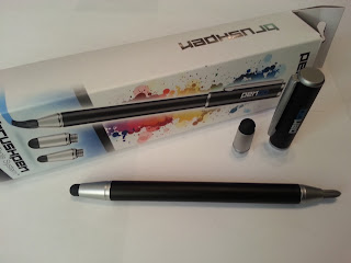
PenGo BrushPen out of the box
PenGo's BrushPen comes with two nibs and one brush.
This is my "out-of-the-box" review my newest stylus by PenGo Creative based in LA. The PenGo is a BrushPen with three attachments. Two traditional black stylus nibs of different sizes and a brush made from synthetic fibers. The stylus' nibs are attached to a hollow tube that allows you to screw and unscrew a nib or a brush at each end giving you more versatility when it comes to mark making application. Having a brush at one end and a stylus at another allows me to turn the stylus around easily so I can switch back and forth without having to go to a different tool.

The pen does come with a cap that protects only one tip of the stylus at a time and is best used to protect the brush from damage. Fortunately the brush head is small enough to keep the user from cutting off strands of the brush when the cap is removed or put back on like you can with other brush/styluses.

The PenGo stylus has a good weight and feel to it, but the cap is surprisingly heavy so it has a tenancy pull away or slip if you hold it to loosely. I find myself taking the cap off to work and putting it back on only to protect the brush head from damage.

Since the iPad cannot recognize changes in pressure (yet) you are forced to go into the settings of whichever drawing program that you are using, to best mimics the shape of the Pengo brush. I have noticed that the iPad does pick up the brush quite nicely so you can draw a circle for example and outline it with the brush making for a nice fluid motion. Having three different heads on one stylus does give you some flexibility, but you are still limited by the program itself and how you have that particular program configured.

Pros and Cons for the PenGo's BrushPen...
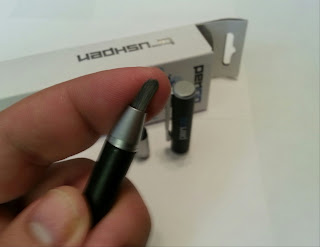
PenGo's brush is made of synthetic fibers
The brush is made of stiff synthetic fibers.

Pros
  • Having a brush helps give the artist a feeling that he/she is using a brush to draw or paint rather than using an inexpensive rubber tipped stylus.
  • I like the way the PenGo sits in my hand and that by having interchangeable nibs at each end I can easily go back and forth between brush and nib without having to reach for a different tool.
Cons
  • The cap add additional weight to the back end of the stylus and pulls it away from the iPad's surface if you are not holding it tightly.
  • There is only one cap for the stylus leaving the end not covered by the cap open to damage over time.
  • There is no place to store of keep the third nib and with its small size it can be easily misplaced or lost.
Over all I like the feel of the PenGo BrushPen in my hand, that it has attachments at both ends allowing its' user an go back and forth between the brush and the pen without having to reach for another stylus and its price point of $29.99 for what you get over all. PenGo has also released an app to go with its' BrushPen called PenGo Paint for the iPad which I will be reviewing shortly.

I have read some reviews on Amazon when I was researching brushes for the iPad and some reviewers said that the nibs became unresponsive fairly quickly and some of the nibs would fall off the pen after they were taken on and off a number of times. I will update my review of PenGo's BrushPen in about a month and let you know how it is holding up.

For now I give BrushPen by PenGo...
5 out of 5 stars

Thursday, May 23, 2013

Splashtop 2 Review for the iPad, iPhone and Android devices

Using Splashtop 2 to remote access your desktop computer using a mobile device
Splashtop 2 lets your mobile device remote access your Mac or PC.
Today I am reviewing Splashtop 2 for the iPad, iPhone and Android devices made by, you guessed it, Splashtop. My last review for XDisplay is another app developed by Splashtop that lets you turn your iPad, iPhone or Android device into a second monitor for your computer. Splashtop is a remote access program that allows you to access your full desktop from your mobile device.

Splashtop 2 allows you access the your desktop remotely regardless if you have a Mac, PC, Linux for $4.99 if your mobile device and your computer using the same WiFi connection. Once you are connect your mobile device to your computer you can view your full desktop allowing you to open documents using software on your home computer. What to access Adobe Photoshop and edit an image from your iPad? What to open word and edit a resume, email it to yourself and open it up on your iPad? You can do all of this using Splashtop 2.

If you want to remote access your desktop computer for any WiFi connection you will need to pay $9.99 for a subscription, but that is a small price to pay to gain quick access to your desktop computer. I have a dated cable device that allows me to view my TV over my laptop remotely, but does not work on the iPad or my Android phone. I log in using Splashtop 2 and I am able to watch my local sports teams wherever I have a WiFi connection.

I would recommend Splashtop 2 for accessing your home desktop or work desktop remotely, but trying to use programs like Photoshop do not translate well to the smaller iPad screen. For accessing files, making simple changes, emailing missing documents or watching TV (my favorite) Splashtop 2 is worth the purchase, but if you don't need to access your desktop regularly for work I wouldn't recommend purchasing the program.

I give Splashtop 2...
4 out of  5 stars

Saturday, May 18, 2013

XDisplay by Splashtop for the iPad

XDisplay allows you to turn your iPad into a second monitor.
Have you ever worked in Photoshop on your laptop and needed a second monitor so you can have multiple projects open at once? Well XDisplay by Splashtop is an app that allows graphic designers on-the-go to use you their iPad or Android device as a second computer monitor. XDisplay can be password protected so someone doesn't try to hijack your screen and it uses touch controls allowing your fingers to move windows you have open on your iPad rather than using your mouse.

XDisplay also has a few features that can be activated by tapping your iPad's screen with three fingers such as, allowing you to play sound iPad's speakers rather than your computer, sharpen your iPad's resolution, control monitor settings and pull up your iPad's digital keyboard so you can type directly into a web browser or a Word document.

XDisplay has a Free and an Unlimited version for $4.99. The Free version only allows you to connect to your iPad for 10 minutes before it shuts it off forcing you to reset the app and reconnect it to your monitor. For $4.99 you get unlimited use of XDisplay which is a good deal considering the cost of a second monitor and the hassle of caring it around with you. XDisplay is great for someone on-the-go who uses programs like Photoshop and Illustrator, but if you do most of your graphic design at home or at work you are better off a second desktop monitor. 

XDisplay is a simple app that allows graphic designers on-the-go more versatility than ever before, but doesn't really replace a good second monitor at work or at home.

I give XDisplay by Splashtop...
5 out of 5 stars

Thursday, May 16, 2013

Sketch Club Review for the iPad

Sketch Club's homepage
Sketch Club is a social sketching app for iDevices.
Just like any other artist I find myself in need of constant validation. It doesn't matter if it is a 10 foot sculpture or a 20 minute doodle all artist crave feedback from friends, family and most importantly their peers. For those who need of constant scrutiny I have an app for you, Sketch Club, a social app for the iPad, iPhone and iPod.

Sketch Club is an above average sketching program that allows you to customize a Sketch Club account by creating your own avatar, post your interests and sketches you have created using the app and reach out to other artists on the site. You can make your artwork view able to the public, receive comments by other members of Sketch Club and likes or dislikes titled "rules", "okay" or "sucks" on someones images. You collect glops which counts the number of views that you receive which leads hearts that you receive for a certain number of views. There is a ranking system based on views and depending on the number you can have your work previewed on the main site. The app creates a competitive atmosphere, but most of what I have seen has been positive. You can track your membership information from your page and collect fans who like and follow your work as well.

In addition to your personal page, Sketch Club allows you to live chat with other members signed into Sketch Club and even live stream your artwork so people can chat with you while you are working on it (see images below). Artist also use the "live stream" option to host classes of your own design. You can use your mic and talk to members who are following along as they types out questions about your work. Being able to type while you work would greatly benefits an art teacher as they go back and forth as they work on a sketch in class, but I find the go between extremely distracting.


Along with "live streaming" you can upload your videos to the Sketch Club's YouTube page and receive feedback there as well. I have not tried this option. There is a record button where you can change the video quality, zoom in, select music, export images to photo library and upload your video directly to YouTube.

Sketch Club is an amazingly versatile app that allows users who are obsessed with social media to bring that obsession to their art. Sketch Club has a wide range of brushes, color selection tools and layers that allows it to bring a lot of the same functionality that you get with some of the big name sketching apps with only a few drawbacks.

Here are my Pros and Cons for Sketch Club

Pro
Sketch Book has a number of brush options.
  1. Sketch Club is a social networker's best friend giving the user a lot of options for getting their work out there and getting people to look at it.
  2. The live stream and video capability is a great tool for educators allowing students to follow along with your lesson on their iPhones or iPads as well as the video record option to share you lessons on YouTube.
Cons
  1. Brushes and tools are not as intuitive as other apps, you have to look around for opacity and brush sizes each time you want to make changes. 
  2. The app has filter options that seem to appear to more gimmicky than useful tome and I find myself avoiding them all together.
Over all Sketch Club is great for artists addicted to social media and I see a lot of good applications for educators in and out of the classroom. For .99 cents you can't go wrong with Sketch Club, but it won't replace some of my more robust sketching apps.

I give Sketch Club...
5 out of 5 stars

Sunday, May 12, 2013

Adonit Jot Pro Stylus Review

Over the past month I have scoured the Internet look for a stylus that were more responsive and more accurate for sketching than the generic on you pick up in any store. After reviewing a ton of websites, YouTube videos and Blogs on the subject I picked the top styluses, contacted the companies and asked if they would send a sample so I could review their product on my site. Only two sites replied to my request on only one of those actually sent me a stylus to review so here it is, the Jot Pro Stylus from Adonit.

The Jot Pro Stylus from Adonit
Jot Pro uses a flat disk so you can see exactly where you are.
Up to this point I have been alternating between using my fingers and a cheap/generic rubber tipped stylus I purchased from Amazon for my first generation Kindle Fire. Using the rubber tipped stylus gave me more control than using my figure, but the thick-round tip made drawing fine lines difficult. After trying the Jot Pro Stylus however it put my view sketching on the iPad and Andriod tablet in a whole new light.

The Jot Pro looks and feels a lot like a well weighted pen rather than a flimsy rubber tipped stylus you are used to with the traditional stylus. A rubber grip is smooth and keeps stylus from sliding in your hand. The Jot Pro is also magnetized so it will stick to the side of your iPad if you are using your iPad without a case. The Jot Pro however is so heavy that it can be prone to falling off the side of the iPad if you move it around too much. Since I don't carry mine on the side of my iPad it didn't really concern me until I put it on a loop on the front of my iPad case. When I flipped over the cover and laid the cover underneath the iPad the magnet in stylus would turn the screen off which can be frustrating.

The Jot Pro also uses a clear acrylic disk rather than a rubber tip to help it slides across the surface of your iPad or Android tablet. The disk slides very easily across the surface and since the disk is clear it is easy to see exactly where you are drawing on the surface of your tablet. The almost pin-point connection between the pad and the stylus makes for very crisp marks for sketching in most of the professional sketching apps you find in iTunes or Android Play.

Now. The Pros and Cons of the Jot Pro Stylus form Adonit

Pro
  1. I really like the weight of the stylus and how it feels in my hand when I hold it and when I draw with it.
  2. The fine point and clear acrylic disk makes it easy to see exactly where you are drawing and what the line looks like without having to pick up the stylus to check your work.
Cons
  1. Like most styluses the Jot Pro does not function as well if your screen is smudged or covered in oil left from your fingers so it requires you to clean the screen more often then it does when using other styluses.
  2. Over time the acrylic disks on the tip of the Jot Pro will need to be replaced. The manufacturer recommends once over 4-6 months depending on the level of use.
  3. After only a week the lines quality began to break down and look choppy rather than smooth and even. To fix the problem, I found out after contacting someone in Adonit's customer service, that if you pull the acrylic disk off the tip of the pen and blow in the ball and joint socket dirt caught in that area can cause the lines to appear broken. If that did not work then take some tin foil and polish the ball at the tip of the pen to polish it and remove any debris on the surface.
Over all I am very happy with the line quality of the stylus and how it moves across the surface of the tablet. Having to clean it and replace the acrylic tip can be a hassle, but well worth it if the line quality and responsiveness of the device.

I give Jot Pro Stylus from Adonit...
4 out of 5 stars

LapWorks Stand for iPad 2 and iPad 3

Part of my "Artist Tools in Review" looks at physical components for the iPad and Android that I find useful for artists and educators alike. When I first got my iPad I started looking at cases and stands so I can...

iPad 3 on the LapWorks tablet stand
Lapworks let your iPad work as a second monitor.
  1. Secure my iPad 3 to my hand so when I taught sketching classes at the local art museum I could hold it without fear of dropping it.
  2. I could find a stand to use in conjunction with apps like XDisplay (see XDisplay review) allowing my iPad to function as a second monitor when Photoshop on my laptop.

I searched for both products on the internet and I ran across an iPad stand from LapWorks that fit both of my needs.

Helping turn your iPad 3 into a sketchbook with LapWorks
Grip your iPad and turn it in your hand as you sketch.
The screen holder can be easily pulled from the base and a velcro strap on the back allows you to slip your hand into place comfortably and securely. The disk underneath the palm feels comfortable as well and it allows you to rotate the screen in your hand 360 degrees without worrying about dropping it. It allows someone who is sketching with an app like Procreate or Sketchbook Pro to rotate his or her canvas for drawing as well as being able to hold your iPad palms out to show students on onlookers what you are working on. When you are finished sketching with the iPad you can return it securely to the base.


The base allows you to turn the iPad 360 degrees all the way around and the fork/disk connection where the screen holder attaches to the base allows you to rotate the iPads screen 360 degrees as well allowing it to from landscape to portrait mode with ease. My wife has been

LapWorks for the iPad 2 and iPad 3
How Lapworks looks without your iPad.
making a habit of steeling my laptop to surf the web when we get home from work so I purchased a Bluetooth keyboard so I can type emails faster and if I use the LapWorks stand I can set my monitor closer to eye level keeping me from having to lean over my iPad as much as I type or watch videos on Netflix.

Over all I am very satisfied with my LapWorks stand for my iPad 3 and I would recommend it for someone who enjoys sketching on their iPad or who wants to use it as a second monitor for their computer at work or at home. I hope you found this review of LapWorks stand for the iPad 3 useful and I hope you continue to check out my blog as I continue to review more artist tools like artist stylists for the iPad and Android tablets.

I give LapWorks Stand for the iPad 2 and iPad 3...
5 out of 5 stars

Saturday, May 11, 2013

My first sketch using ProCreate!

Here is the first sketch I ever did using ProCreate. I started watching a few YouTube videos online to get a feel for what the program can really do and this is what I was able to produce. This sketch and the YouTube videos I watched helped get me interested in creating this blog so I can share what I learned with other creative people. Hope you like it!

ProCreate lets you use a smudge tool to create gradients and blurs. 

New ProCreate Sketch

Here another artwork I created using ProCreate about a month ago that I never uploaded to the blog. You can see this piece in my YouTube review of ProCreate, but I never uploaded the actual image so here you go! I call it Orcs Hate Bunnies! A little nerdy I know, but why play against type?!

I was board one day and decided to create something ridiculous. Mission accomplished! 

Sketchbook Pro Review for the iPad

This is a review for Sketchbook Pro from Autodesk for the iPad. Earlier this morning I finally got around to reviewing Sketchbook MobileX and Sketchbook Mobile for the iPhone and Andriod mobile devices. Much of the app's layout in Sketchbook Pro is the same layout used in the mobile devices with the addition of a few upgrades for the price of $4.99. Lets start with the similarities between the two mobile apps and the Sketchbook Pro shall we?!

Similarities (Sketchbook Mobile and Sketchbook Pro)
  1. First off both the mobile apps have the same basic interface when it comes to tools (see the pictures below) with brush properties to adjust the radius and the opacity by pinching and dragging your finger within the center circle. 
  2. When you click on the brush at the top of the application you can access brushes, radius, opacity and color settings for adjusting hue, saturation and gradation levels.
  3. Mirroring, paint bucket, eraser tool and the line/geometric shape tools work exactly the same in all three apps with not no significant changes.
  4. The layer portion of the app allows the user to create multiple layers and allows you turn the layer on and off as well as make it transparent.
  5. Both the Pro and the Mobile version of Sketchbook allows you to undo and redo a number of your last steps much like Photoshop's history feature.
Brushes are similar in the Mobile and Pro versions of SketchbookBrush and color tools are very similar between the apps

Differences between Sketchbook Mobile and Sketchbook Pro
  1. Brush properties has a similar look in both the Mobile and the Pro versions on Sketchbook with a few key differences. Pro allows you to re-arrange your brushes around the brush properties' circle for quicker access, a bar with different brushes on the left and color samples on the right allowing you to select colors quickly while working on a sketch.
  2. Galleries in Sketchbook Pro allows you sync your images with the iCloud so in case something happens to your iPad you will not lose your work.
  3. Pro allows you add text, edit it, move it around, change the font and color very easily where in other applications you would have to add text using another applications or export it to Adobe Photoshop.
  4. The "Time-laps Record" option in Sketchbook Pro allows you to record your mark making so you can upload it to You Tube and share your work in new and interesting ways.

Pros for the "Pro"
  1. The "Time-laps Record" option is a great way to demonstrate speed painting as well as uploading step-by-step drawing instructions for students who might have missed out on a drawing assignment in class.
  2. A lot of additional brushes with the ability to make some subtle changes to your marks allowing for a greater variety of tools.
  3. The ability to auto-upload your work from Sketchbook Pro to the iCloud so you back it up online.
  4. The text option allows easy manipulation of words not only in your drawing but also in your "Time-laps Record."
Cons for the Pro
  1. The program should be running very quickly on the iPad 3 or iPad 4 with its increase memory and processing power, but it lags a lot like a piece of software that was installed on a computer that is to old to run it properly.
  2. You are only able to create 6 layers maximum in the program which is very limiting if you want to use a wide range of color. You also can not name each of the layers just in case you want to keep them clearly separate.
  3. The brush properties is also a little difficult to use and it seems to have trouble understanding if you want to increase or degree the radius of the brush or the brushes opacity. I prefer a bar on the side of the program that allows for quicker adjustment.
  4. Images in all three versions of Sketchbook are limited to a PNG file which means the lose of all of your layers.
Over all the only two things that Sketchbook Pro has that separates itself from similar illustration apps on the iPad is the text tool and the "Time-laps Record" and both of those things are not enough to put it ahead of apps like Procreate. In a head to head battle I would choose Procreate every time. If you have either of the two mobile apps and you want to have an easy transition to the iPad or the newer Android apps then yes I would go with the Sketchbook Pro, but otherwise stick with Procreate instead.

I give Sketchbook Pro...
4 out of 5 Stars

Sketchbook Mobile Review for Andriod and iPhone

Today I am going to review the first sketching program I ever used on a mobile device, Sketchbook Mobile and its younger brother Sketchbook MobileX by Autodesk. Autodesk, the creator of 3-D animation programs like Maya and AutoCAD, has created a mobile sketching program allowing the user to access a number of mark making tools (brush, pencils, markers, etc), a pallet of textures and marks and a interactive color pallet.
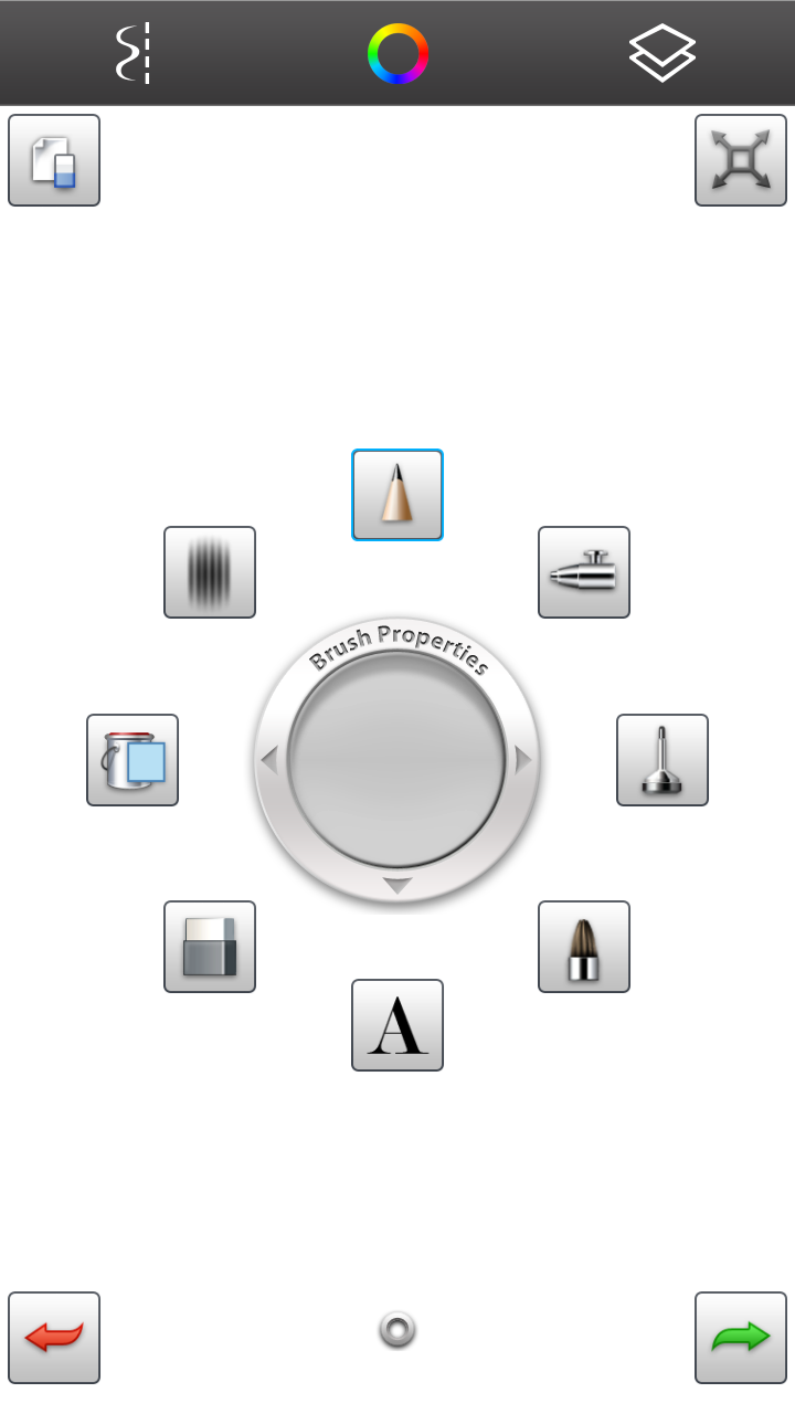
Brush Properties accesses your tools.
Sketchbook MobileX: Free on iTunes and Android Play
Sketchbook MobileX, the free version of Sketchbook Mobile is designed to run on mobile devices and 7 inch tablets or smaller. This app gives the user access to a few basic tools and brushes, but to access more options the user will need to upgrade to the full version of Sketchbook Mobile for $1.99.

In Sketchbook MobileX you have access to the same color pallet, mirroring, layers, paint bucket and access to only a few of the drawing tools so your experience is a little watered down from what you will get from the full version. The brush properties allows you to access a wheel encircled with your 8 brushes options and a transparent circle in the middle that helps control the radius of the brush as well as its opacity. Sketchbook MobileX also allows you to import images that you can color or clean up and when you are finished you can export the work to your sd card or internal memory so you can share your work with others.
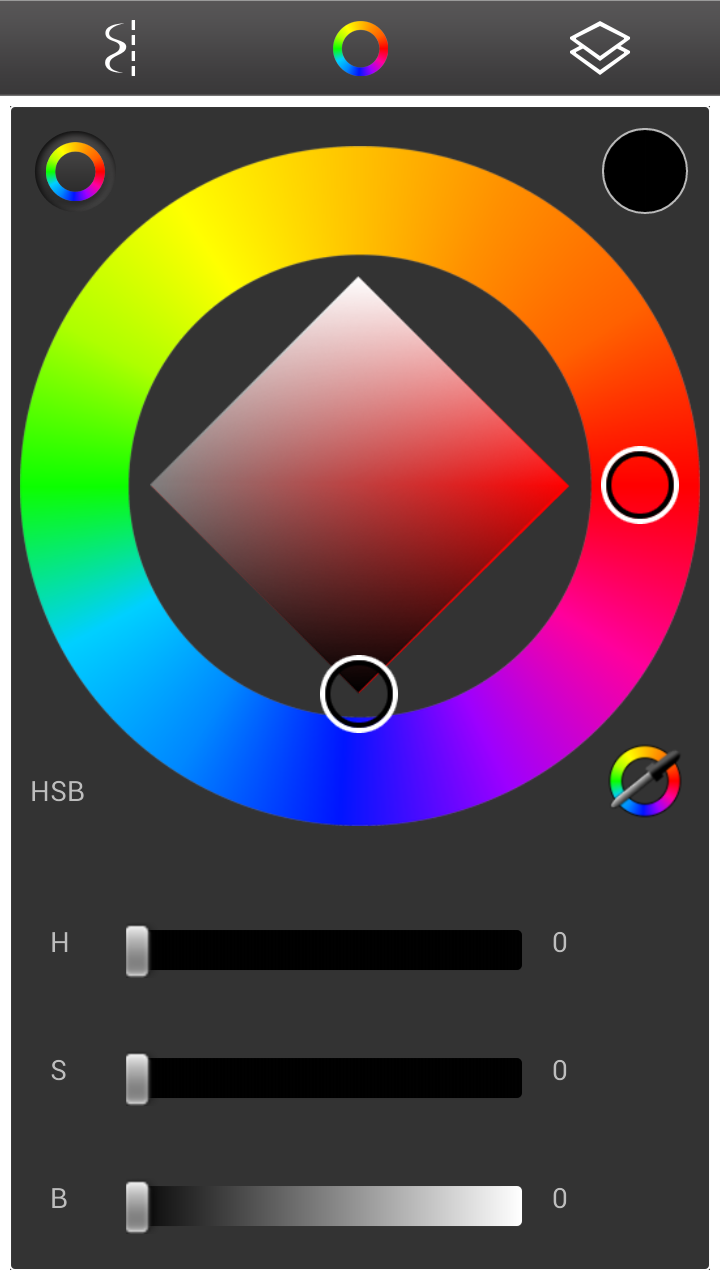
You can adjust your hue, saturation and  brightness.

Pros
  • A free program that allows you to import and export images from your mobile device.
  • Allowing you to use 8 different brushes changing the line quality and color of your marks.
  • The fill bucket allows you to add color to a background layer before coloring over it.
  • The brush properties give you quick access to brushes as well as adjust the radius and opacity of your mark.
  • Controls to change the Hue, Saturation and Gradation of each color giving your more color options.
Cons
  • There is no undo or redo option to make changes just a few steps back without using the eraser.
  • The brushes you have access to is very limited and so is the ability to make subtle changes to the colors you are using in your project.
  • Layer alterations is limited to adjusting the transparency of the layer itself without allowing you to transform it in anyway.
  • You are limited to only 3 layers to work with in the free version.
I give Sketchbook MobileX
4 out of 5 stars


Sketchbook Mobile: $1.99 on iTunes on Andriod Play
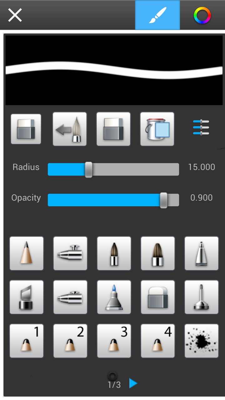
MobileX gives you more brushes to choose from.
Sketchbook Mobile has the exact same layout as Sketchbook MobileX with a few bell and whistles the free version has left off. Sketchbook Mobile gives you access to a gallery which allows you to view your work side by side. Inside the galleries you can easily import, export, duplicate and delete files with ease while you are working on a project.You can transform a layer by zooming in and out, rotating and move layers around in your work, access forty-five different brushes, change their radius and opacity and undo and redo changes you have made similar to the history option found in Photoshop.

Pros
  • Galleries that allows you to view your work side-by-side and  import and export your work with ease.
  • Access to 45 different brushes and controls to change radius and opacity of each mark.
  • Options for rotating and transforming your layers from inside the program rather than using the options found in the camera's gallery.
  • Access to tools that can create shapes and mirroring that is found in Sketchbook Mobile.
  • Just like in Sketchbook Mobile you can change the Hue, Saturation and Gradation of each color giving your more color options.
Cons
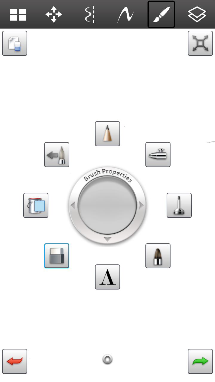
Brush Properties has added undo/redo option.
  • The size of your canvas can be limiting. It is difficult drawing marks on such a small screen and having to constantly go to transform to zoom in and out is a hindrance. 
  • The brush properties allows you to change the radius of your brush by dragging your finger away from the circle to enlarge and towards it to shrink it. Unfortunately this option is often glitches even in the Sketchbook Pro version for the iPad (review coming soon) making easier to just go into brushes and adjust it there.
  • No iCloud or Dropbox sync to upload your images for safe keeping. If you don't export your work and save it off of your phone as soon as you lose your phone you lose your work as well.
As far as mobile drawing programs go the free version (Sketchbook MobileX) gives you a window onto which to view Sketchbook Mobile so you can decide if you want to spend the $1.99. If you like Sketchbook MobileX I would definitely purchase it especially if you have an inexpensive Andriod tablet or a first generation Kindle Fire. The app's layout is very similar from version to version so if you started with Sketchbook MobileX and move to Sketchbook Mobile or Sketchbook Pro there is a much smaller learning curve then if you switched to a new program all together. 

If you are running Honeycomb 3.0 or higher or iPad running ISO 5.0 or higher you can run Sketchbook Pro so check it out. Come back soon and checkout my review for Sketchbook Pro for the iPad!

I give Sketchbook Mobile...
5 out of 5 stars


Monday, May 6, 2013

Examples of Artwork using ProCreate

Here is an examples of some work that I created using ProCreate. I did the sketch on paper, scanned it in, opened it up in ProCreate, outlined it and colored it in.
I know. I was excited about the new Iron Man 3 movie.

I know. I am a nerd!